
Trend List Update: An Overcast Week
Q1 2019 Final Week update

This past week took on a heavier note courtesy of the financial sector hit and a nascent “inverted yield curve” narrative. We will only know in retrospect if this was the “beginning of the end” (or is that “end of the beginning”?), or just another single digit percentage soon to be forgotten decline - a bit of noise that goes smooth and invisible on a future multi-year chart of the averages. Let’s just get to the update and focus.
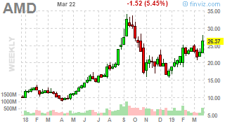
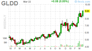
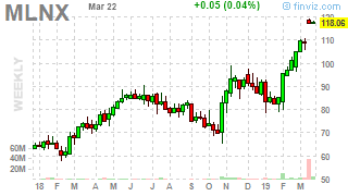
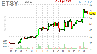
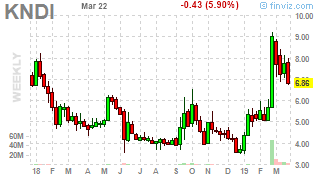
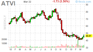
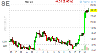
Here is this week’s Top 10 leaderboard for LONGS and SELLS. It’s not a perfect list in any sense of the word. It’s not a “final” to do list, or “THE” list for the year or even quarter. It’s simply my system generating ideas based upon a few rules working with weekly prices and averages, and its closest “relative” would be relative highs and lows or “new highs or lows” type of lists.
It will change over time as leadership clarity emerges. Some ideas will “fail” and hit their suggested stop loss prices. Since this is a new list, you will see suggested initial stop loss exit prices. Over time, if an idea continues to run in a potential long or sell trend, then the suggested stop loss exit prices will be updated. Given the longer time frames, stop loss updates take a long time to happen.

What does those charts look like? Here they are.


A word of warning, from time to time many ideas and charts hit this filter for event-driven reasons, usually due to mergers and acquisitions, so do be careful.
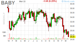
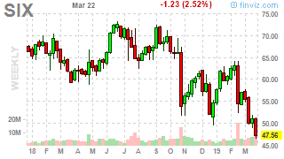
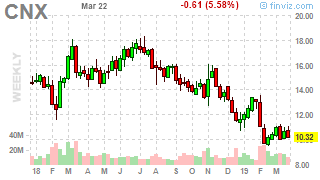
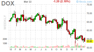
And now for the Top 10 SELL leaderboard as of this week.


And as I have noted not all ideas work out, sometimes they will be stopped right out of the gate and hit their suggested stop loss exit prices. There’s just no telling when.


This week’s Top down summary reflects the growth of new ideas on both long and sell side but the recent week’s price activity is reflected in the growth of notional losses. The following table is simply a summary of long ideas, sell ideas, how many have a notional gain or loss, and how each Top 10 leaderboard for the week is doing.
Below we see a notional net gain of 7.9K for 271 ideas (made up of 198 longs and 73 sells).
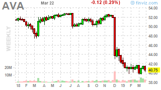
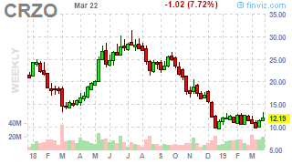
And now for a new feature which will be called “underperformers”. These are the laggards for long and sell ideas. The long laggard charts are shared below.


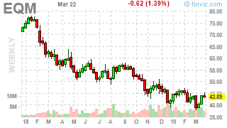
For all we know the long (and short) laggards may eventually be stopped out. They may even begin the long trek towards becoming an idea in the opposite direction eventually. Let’s now take a look at the Top 10 SELL laggards.


Here is the list most folks are looking for (nothing like a list to draw attention) - what this has in common with the world of entrepreneurs, startups, and just plain business, is that ideas useless without execution. I can give you ideas, and even suggested stop loss prices and / or risk sizing but most will find it drudgery to follow week by week and keep it almost routine. Nothing excites like the drama of being “busy” with losses.
Feel free to pay a few hundred dollars per week or month for similar content but just know it may well require thousands of dollars of “experience” to develop a process that aligns with who you are or what you’re about. This list looks really really long on a mobile device but those who know will remember that the lineup used to be about a 1000+ ideas long. I’m experimenting with an alphabetical lineup for the ideas out of mercy. But there is that new app which takes images and puts them into spreadsheets - what a time to be alive (no more transcription horrors :) ).

Let’s go to more charts before closing out this update with 20 more charts.


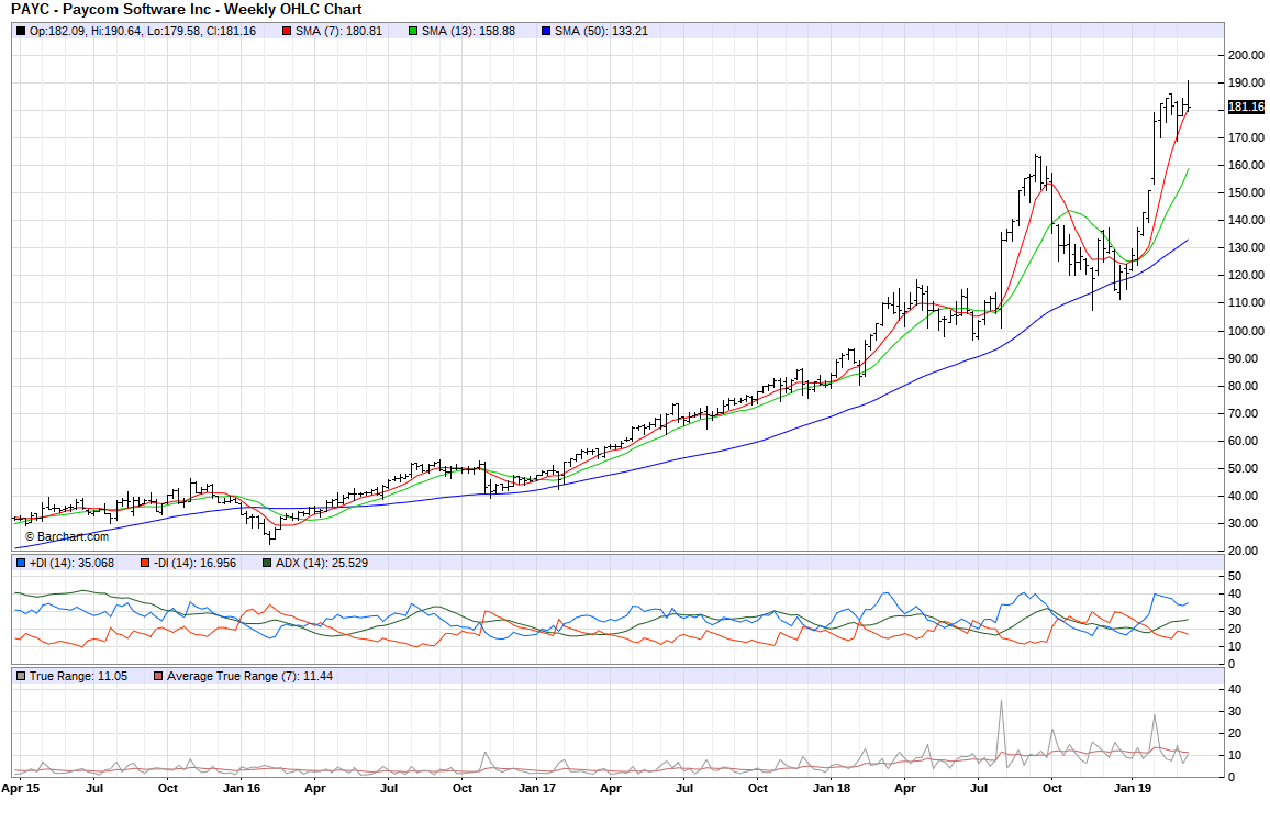
This lineup has little to no glory. It’s not a “sexy” lineup of SaaS plays. Ah well.
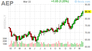
Here are some more sell/avoid charts as of this week.


Koyfin Trend Lists are another way to keep tabs on some of these ideas but this list will be updated hopefully each week as part of routine “housekeeping” for the list.
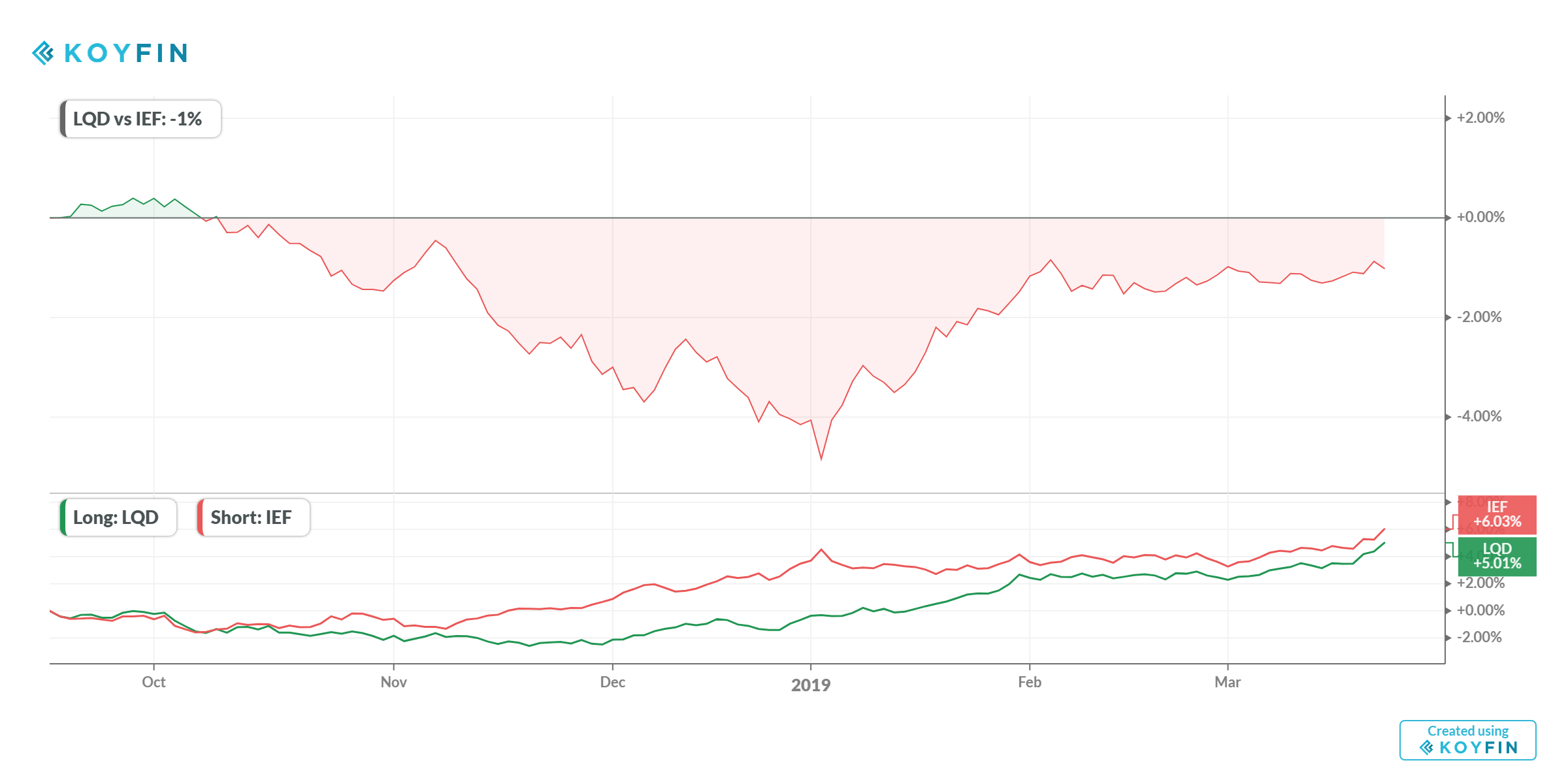
Speaking of Koyfin, I like being able to generate a few Adam Robinson inspired macro top down views. First LQD vs. IEF (corporates vs. 7-10 year treasuries), then copper vs. gold futures prices. (No, I will not post an inverted yield curve graphic.)

Crude oil prices have a ways to go before an outright trend following buy. It’s still a “bounce” and then lots of “testing” ahead.


I am expecting the end of the USD “bull” but right now this contract is trading with roughly 1.4 ct average weekly trading range. The most recent “low” for this futures version of the EURUSD pair is 1.1420 or so. It could go to almost 1.17 before being invalidated as a bullish USD pair - so far it’s still “okay” as a potential entry for USD long. Let’s take a look at the DAX. So far it could be a rollover in the making.

And now for BTCUSD. Bitcoin. The decline has finally petered out as it were. Noted in sibling publication “The Big Stack”, at its StockTwits feed, is a report regarding the “true volume in bitcoin” - it’s a lot smaller than apparent with a profile not unlike gold. Digital gold may in reality trade more like original gold than we realize.

Eurostoxx 50 may have also finished a run, breaking past the longer averages but not quite in the running for new base and higher space.

The 10 year looks like 3 years ago but is that all? Same with the 30 year of course.


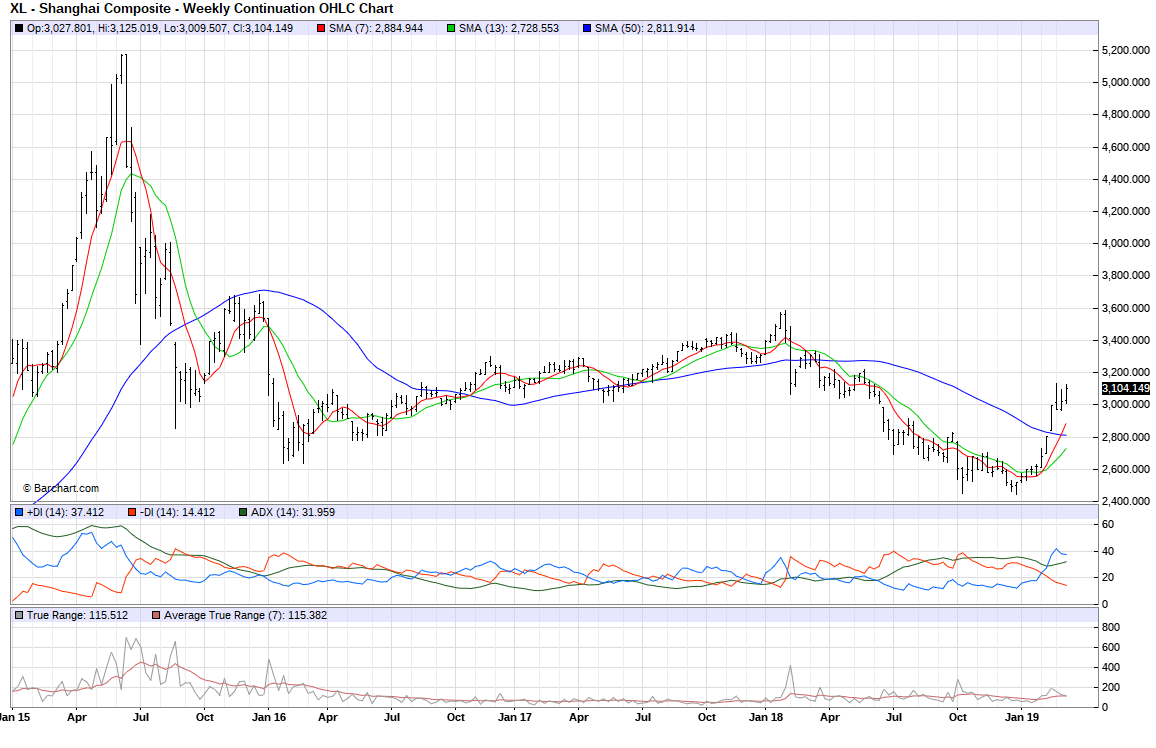
The Shanghai Composite. We are so far from what some are hoping for. Early days.
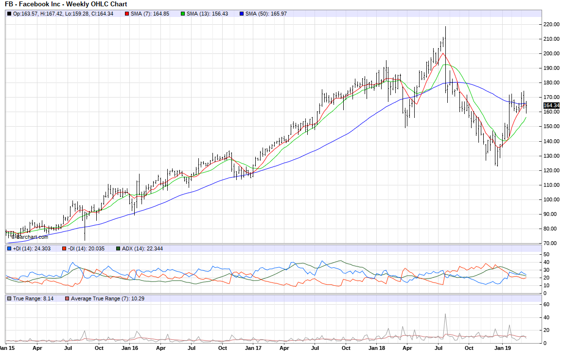
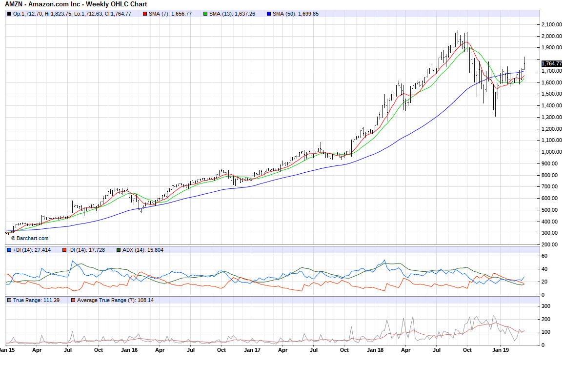
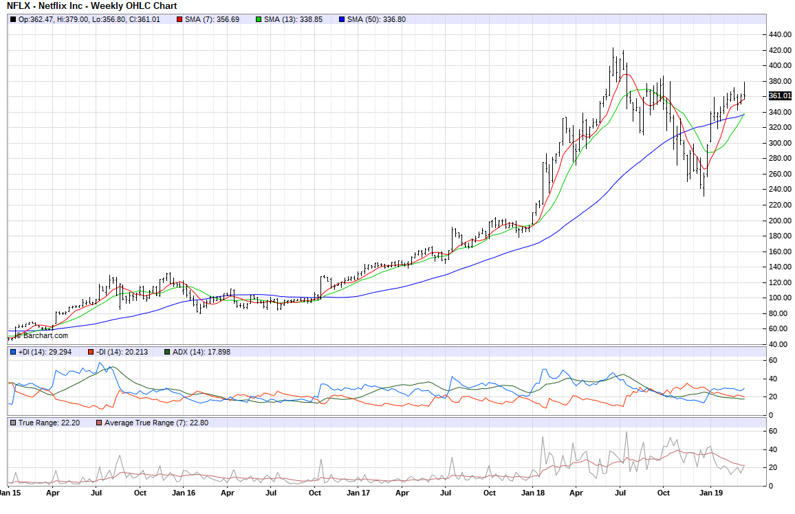
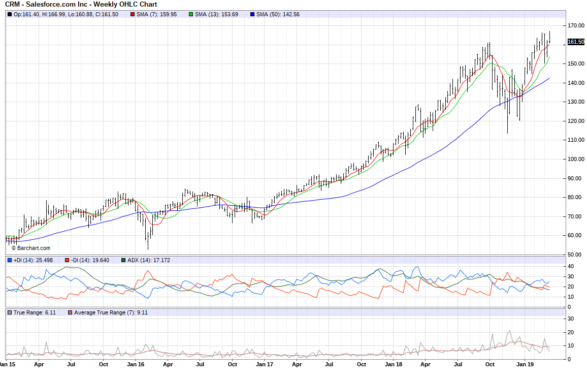
Let’s go to the “FANGs” and assorted cousins.


And now for other “softies” running hard into new highs. Adobe (ADBE) is like an alternate to Apple and Amazon as the “A” in “FANG”.


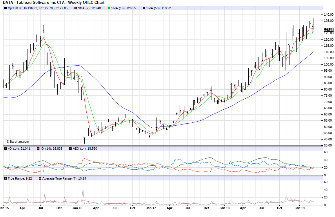


and the granddaddy of the SaaS includes of course Salesforce (CRM).
18 months ago Mr. Market was “lit”! It was whitepaper after whitepaper on crypto projects, and coins were falling, crypto pennies from heaven, airdropped out of the sky. Steaks medium rare for everyone! Right now it’s S-1s after S-1 SEC filings - so many debutantes, post-crisis pre-adolescents jacked on years of QE. Lots of startups ready for public reporting “adulting”. Crows’ feet in abundance courtesy of the cash burn.
Random chart. The Eurodollar futures chart. Just a random chart really.
