


Q1 2019 Trend List Update
A Long Recovery Ahead Going Back To Year Ago Peaks

Nothing is clear unless in retrospect. We won’t know until after a round of speculative fireworks happens and the smoke is blown clear what and who is left standing. This quarter, we have seen some great winners, but the real action is yet to unfold as a pantheon of privately held leviathans become publicly traded enterprises. Everybody is taking a stance but we won’t know how things turn out until 2019 is in the books.
This update will have some issues due to some data housekeeping. All estimates and results are tied to the market close as of March 28 but it will have to do for our purposes and time frames.
Let’s take a look at Top 20 summaries for our Q1 2019 closing update.

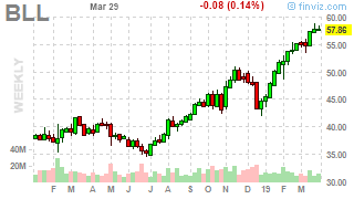
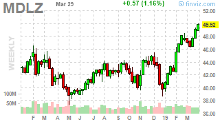
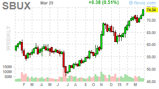
The Top 20 charts on the long side include the following ideas. From my vantage it’s just ideas reduced to prices but if we take a step back we notice it looks nothing like the Top 20 lineup from the end of Q2 and beginning of Q3 2018. As we see, leaning on simple price following of weekly prices and longer time frame averages, a lot can happen “all at once”. The most impressive “recovery” includes semi maker AMD and SNPS. The most instructive chart for trend following may in fact be AMT. Rain or shine, something is “working” somehow, even despite the Q4 2018 declines.


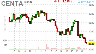
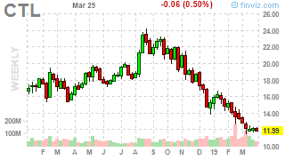
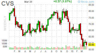
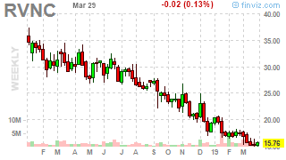
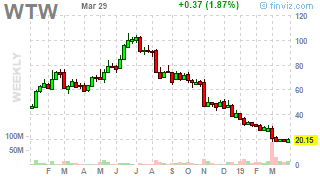
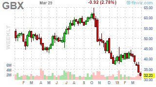
And now for the Top 20 SELLs (or shorts or just plain avoids) ideas. At the head of the list is the mirror to Athleisure / casual work wear players like LULU: TLRD. Suits are nice for special occasions, impressing the in-laws when you first meet them, holiday gatherings and being streamed online for content/media distribution (sometimes) but that’s it.

Many of these are truly “avoid” charts - all that’s missing from them is a rail for their almost steady month after month staircase decline.


I would like to offer the larger ideas universe, some more charts and also a few links of interesting outside reads before wishing you a good weekend and week ahead. First up is the LONG ideas list, which despite the torpor, side-ways price action, and macro worries, continues to grow steadily larger. It has been sorted in alphabetical order for ease of scanning. A simple “risk per share” is also offered to give those who are bit more active a sense of how much USD risk is in trend trading each idea. (i.e. Your system enables you to risk say $100 of loss for a trade. The “$RISK/share” is $1. That would mean you might trade $100/$1 = 100 shares. Not sophisticated. And the real secret sauce is up to each risk-taker to determine how much they can risk to lose in a trade. There is much more to this concept but it is a starting point to help you focus more on risk management and less on “rightness” of any specific idea.

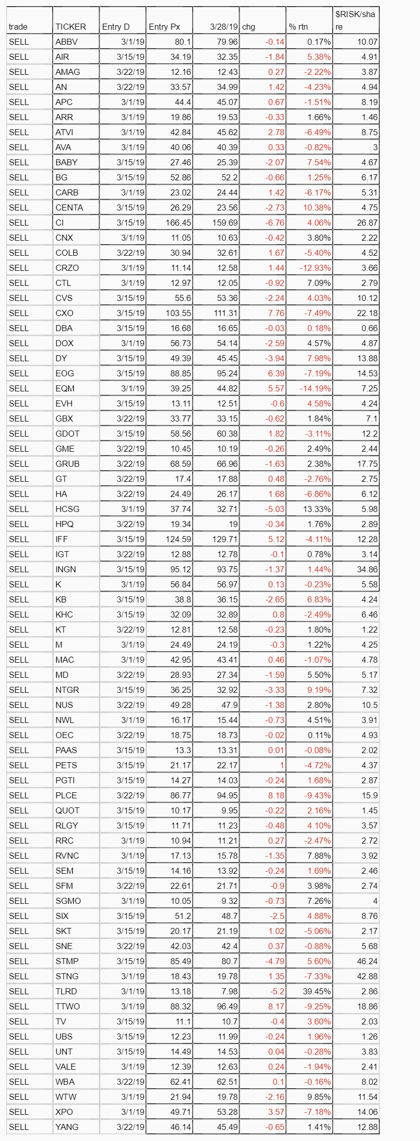
And now equal time for the SELL ideas. As with the long ideas list, risk per share suggestions have been offered as well, to give you a sense of the risk of going “short”.
And now for charts and then some links of interest, both longs and shorts.


Friends from the “fintwit” world, @Fallible and @koyfincharts created the following macro pieces about yield curve inversion. Submitted for your consideration, a pair of entertaining and educational pieces on what to think about, beyond the sound-bites and quick takes on the “R” word. They are overlapping pieces which may help you.
Yield Curve Inversion Causing A 2019 Stock Market Crash? Bear Market Now?
( Yield Curve Explained )
Macro factors to Consider As Recession Talk Heats Up “Investors tend to pattern match and view any upcoming recession as a repeat of 2008 or 2001.” “Every cycle is different and understanding the unique characteristics of the current cycle is key to not getting caught up in the doom and gloom discussion about the next recession.”“

Okay, back to a few more charts to close out with top down views.


Not exactly the all clear but then it never is until you can see it in retrospect.