


New Heights, Thinner Air Again
November 2019 Trend Trading Update

I have a chart with a cool high altitude space-ship image from Jan/Feb 2017. This was my way of visualizing the All World Index moving to new highs. It peaked a year later in Jan 2018 and then that was it … until now. Back in Jan/Feb 2018 my systems hinted at a possible peak and or pause (the over-simplified version was that the ADX had hit the 60s by then which usually marked a late stage trend for me - it’s flawed but works).
18-plus months after the Jan/ Feb 2018 peak, we are ready. Ready for possible new highs. I had had enough practice after years of weekly chart reviews and spreadsheet updates to prep for a long wait after the Jan/Feb 2018 highs. My time frame was 18 months, based on experience. Here we are at 18-plus months. 2020 here we come (I hope.) You can call me out or call me crazy or stupid but it’s okay - price doesn’t judge.

This update is also going to mark the beginning of a more conversational style of update. I will share what I think is relevant based upon my updates - it will vary.
While the price following (i.e. “trend following” or “trend trading”) method I have focused on since the beginning of Rooster360 — since its days as a free Wordpress blog — has evolved. But it really hasn’t changed all that much. It’s all about following prices over long time frames, and constant reminders to myself to keep an eye on minimizing losses, while accommodating a natural inclination to make narrative explanations or “reasoning” about market price behavior and future predictions.
In recent months, I tried to simplify updates of an ideas universe which runs to hundreds of ideas when the market if running either “hot” (upwards) or “cold” (downwards). Regular readers know I would begin with a stop loss update of ideas which hit estimated stop loss exit prices - which were all calculated as a simple multiple of a multi-week average true range. I would then move on to the best performers, then laggards and finally potential new ideas. It’s not for impatient people.
This simple and blunt system, when combined with a focus on trade sizing, and adding to winning trades only using the gains, is a good way to keep everyone out of trouble. By “trouble” I mean, I did my best to share notes that you might use to stay in the “game” - by staying in the game I meant that nobody avoids losses, but you can only use losses to your advantage as information about focusing on what’s working.
Anyway. We’re going to look at the same things but I’ll discuss them conversationally.
This week: Lots of ideas were stopped out - 2 sells/short ideas to 1 long idea. Not a bad sign of two things: gyration and movement in favor of more long ideas going forward.
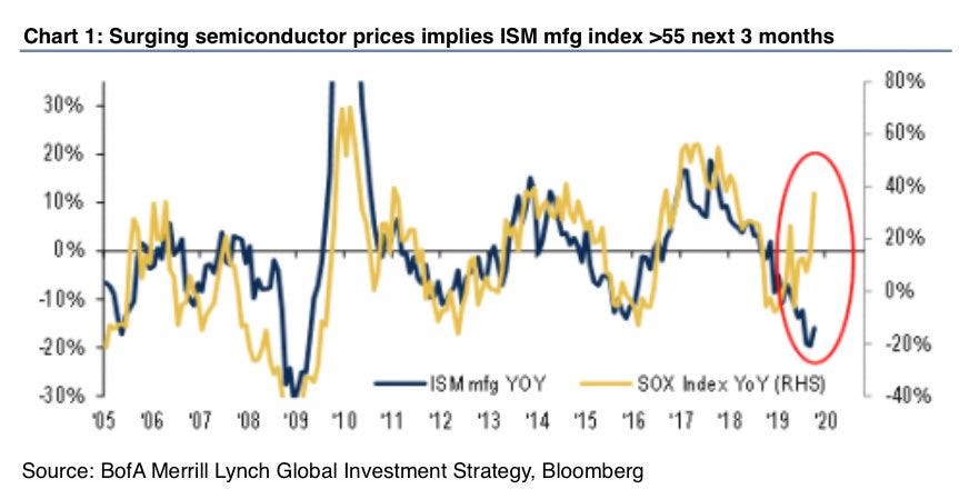
The Top 10 and Top 20 lists for longs (here’s a free Koyfin Charts Top 20 long list) and sells hints at what was obvious to you day traders - semiconductors have taken a robust turn upwards. A good sign in many ways which I hope will not be a head-fake. Let’s be hopeful for more gains and for those gains mean in retrospect - that the broader market and economy still has “legs” (see the title of my last update, you don’t have to read it. I often use a teaser image and a headline to tell you the story of the price action in its broadest sense.)
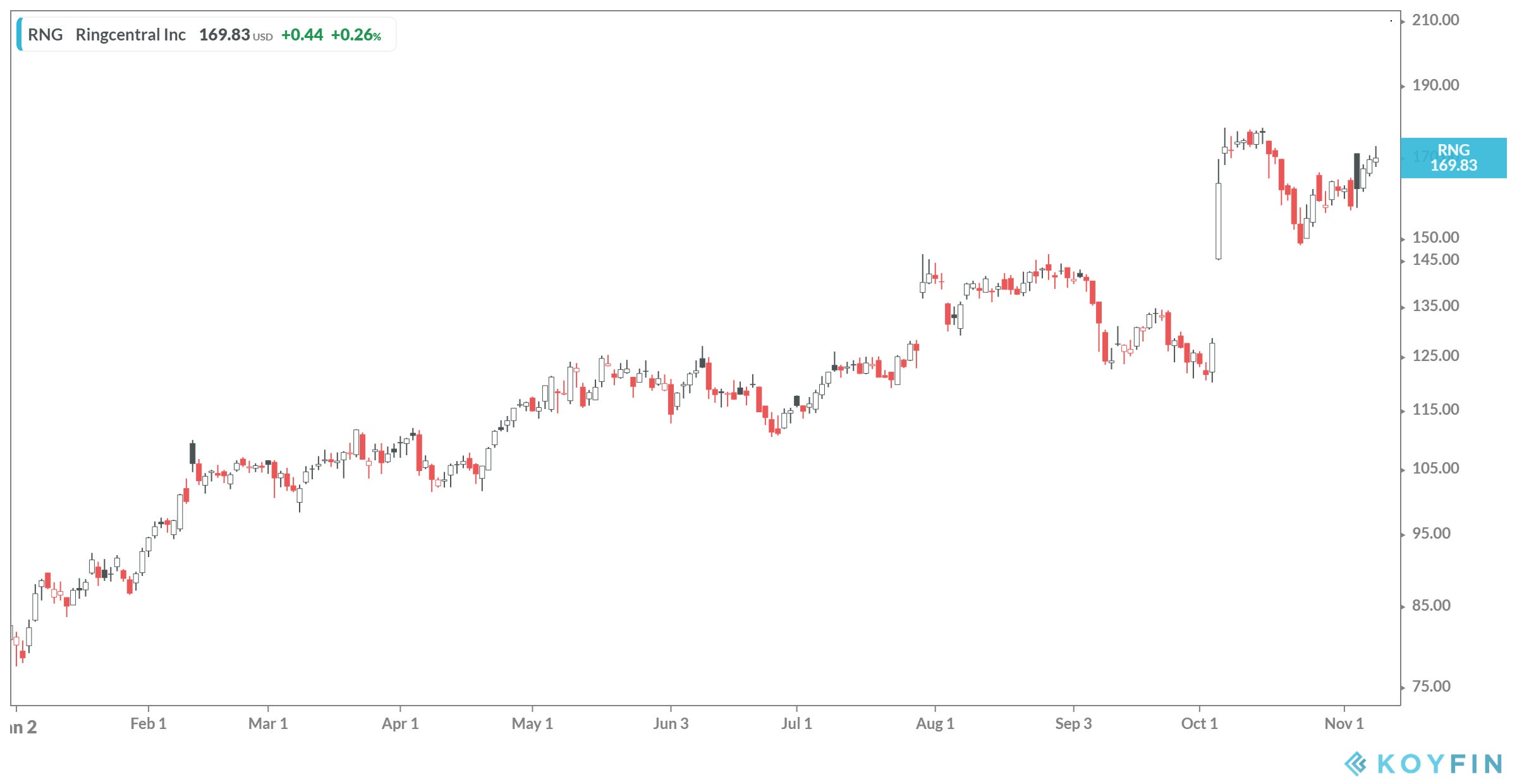
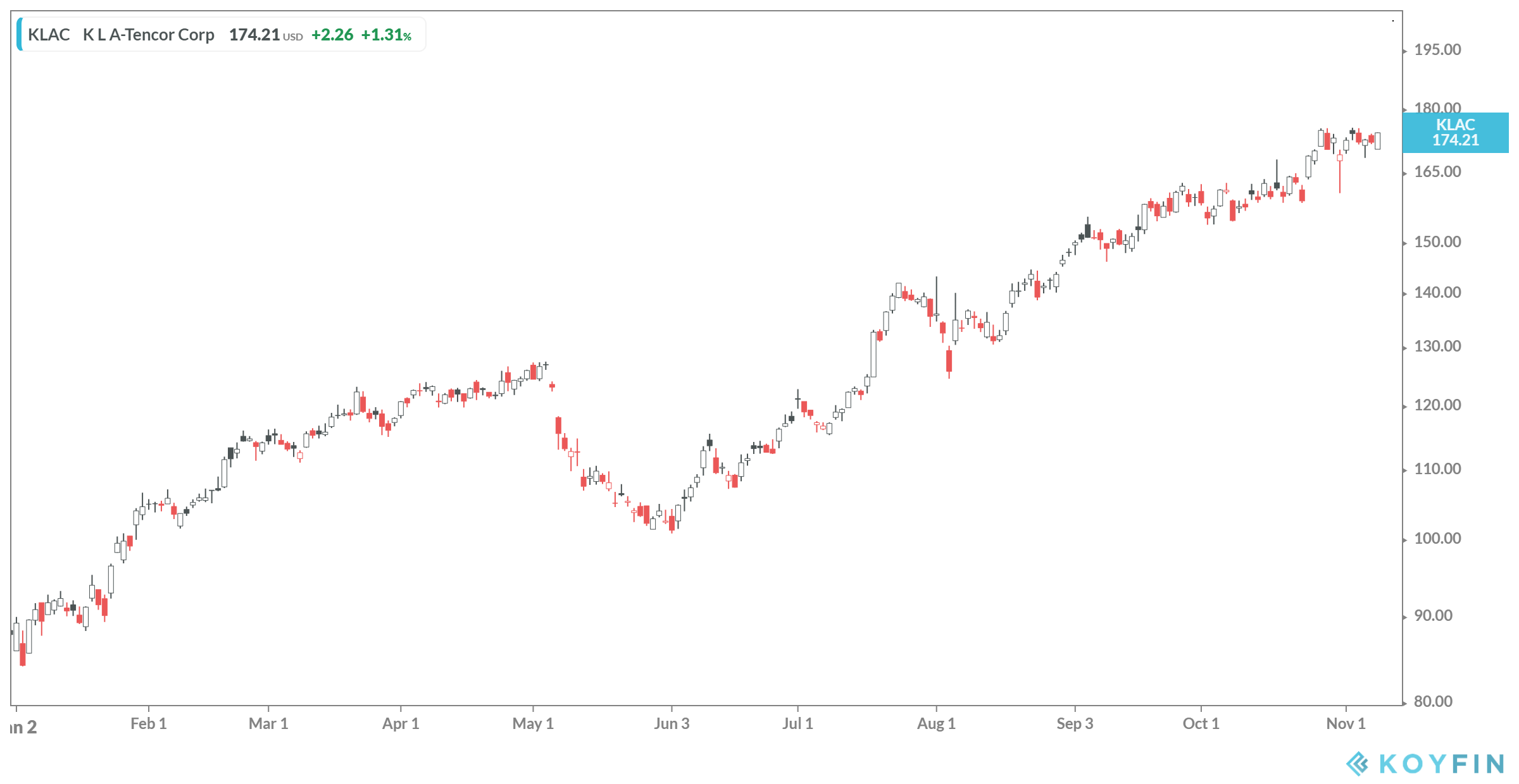
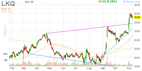
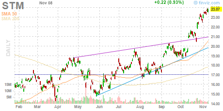
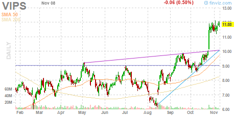
Here are the top 5 charts (based on the best “last 6 month” performers. They’re all great but I have to think about how most folks read everything on a phone. Click on the Koyfin link I gave you and you can play with the list to your heart’s content.


The Top 10 and Tops 20 sell lists (here’s a free Koyfin Charts Top 20 SELL list) are a humbling reminder that not everything is going to work out. We don’t always get the “girl”, “guy” or “person” BUT there’s always someone for each of us. I personalize the markets so that you can personalize it too and at the same time not take the bad news personally. We’ll all find winners. BUT only after surviving a fair number of losers.
No surprise that the top “sell” is an inverse semiconductor ETF.


Hard times for a lot of on-demand / consumer SaaS platforms. Reality sets in.

This used to be a major brand and chart. Times and tastes change.

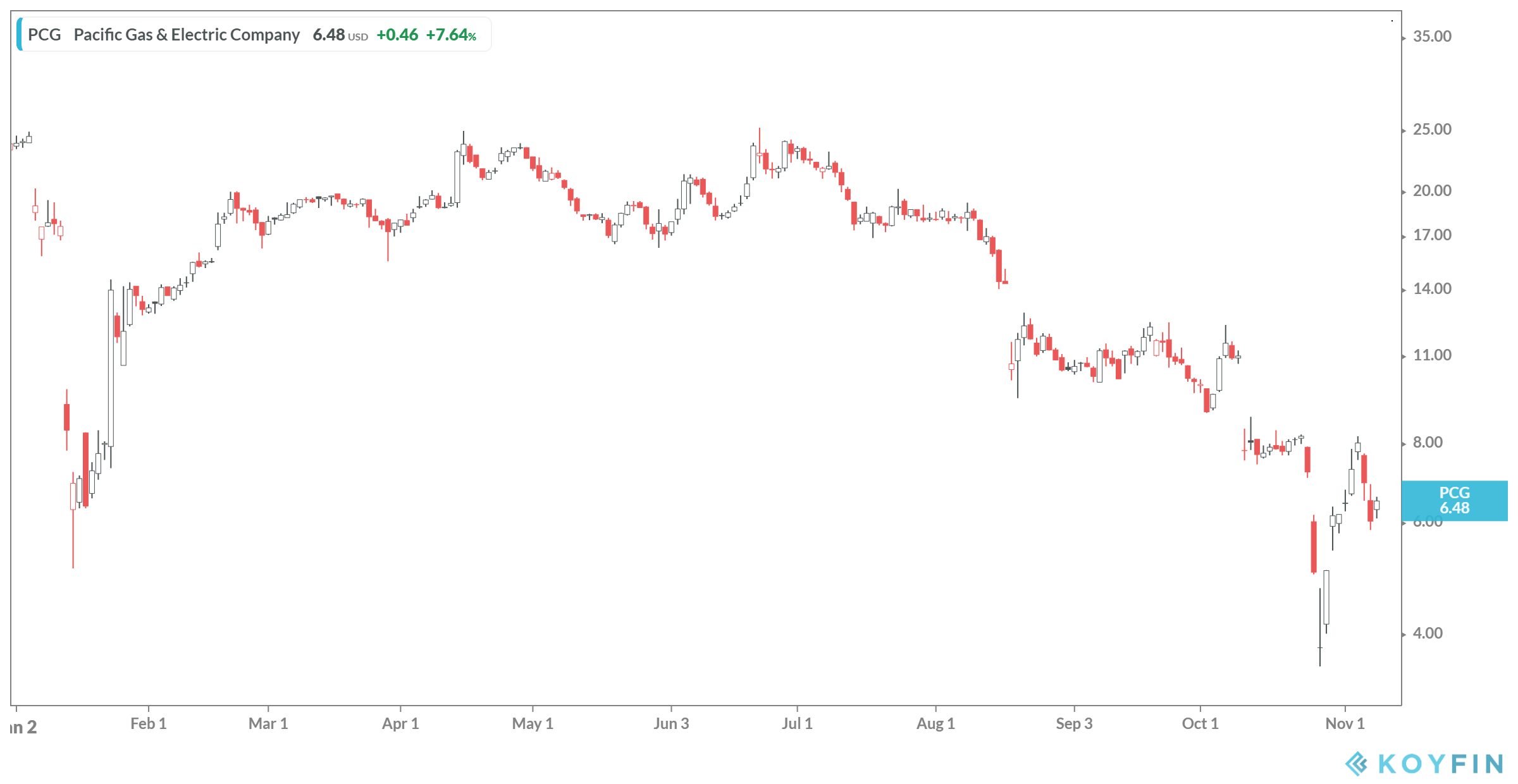
What a mess. No jokes necessary here about burning up. It’s just a sad chart.
And now for some charts: the broader global market cap, semiconductors and one Chinese stock chart (not a stock pick but I do like looking for potential “canaries in the mine” for more to come).
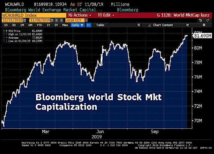

I wrote a few weeks ago that I think the thing to do was to prepare lists and positions for 2020. I want to share some charts from the final week of September 2019. Here are about 2 dozen “long” charts I wanted to share. Some have begun to run and others are just sitting there. This is not a bearish line-up and there’s room for optimism.


I admit I’m not excited after looking at macro charts for bonds and futures charts, after reviewing the major stock indices - but the stars don’t line up for us like that and go “welcome, dear sir or madam, do be seated and would you like a perfect in every way market?” If only life were like that and we didn’t have to go through rejection and loss and had six pack abs and six figure (or more) bank accounts handed to us without effort, worry or risk. We’ll just have to settle for a few fantastic potential trends.
Write me with questions, not for advice but for a sounding board (no promises on answers), if you wish. I’ll try to write more in coming weeks, but I’m in the middle of some new projects and wishful thinking works in progress. Just don’t overtrade and please if you have genuine losses to take based on your time-frame, take them and reset for 2020. Really - prep for Q1 2020. Have a good weekend and week ahead.